
I never thought I’d write this sentence, but here we are: don’t sleep on Nano Banana Pro. Even if you’re a developer. Especially if you’re a developer. Intelligent image creation is here.
I spent the last week putting Google’s new image creation model through its paces, and I walked away with a simple conclusion: image creation is accurate, controllable, and useful for real work—not just for generating surreal cats with too many fingers.
This post walks through a few practical use cases, the gaps it closes, and where it still stumbles. I do a few side-by-sides with OpenAI's current image gen model.
Why Nano Banana Pro Matters
Nano Banana Pro (NBP) is an AI image generator. You describe what you want in text, and it renders the image. That part isn’t new. What is new is how reliably it does what you actually asked it to do.
For years, models like DALL·E, Kling, Midjourney, and the earlier Imagen all hit the same ceiling. They were fine for vibe-heavy concept art, but once you pushed them into anything structured or factual, they fell apart. Some of my early blog covers were using this style of imagery:, which I moved away from b/c it was clearly subpar:
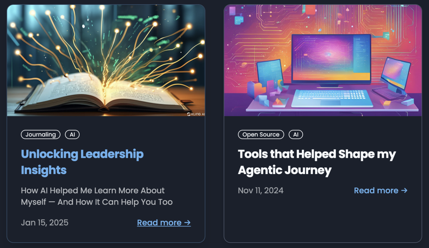
Ye Olden Days of Image Creation
Here’s where the old generation consistently failed you:
1. Text inside images was a disaster
They could draw letter-like shapes, but if you needed precise text—say, a real logo treatment, product packaging, or even a simple title card—good luck. As one example, I asked DALL·E to place my company’s logo and cleanly typeset the name beside it. What it produced was… not great.
As you read through this, look at all the NBP-generated images and scrutinize the text. You'll see it's perfect. NBP can also render text in fonts or even create brand new fonts.
2. They lacked true semantic understanding
Ask for an infographic, flowchart, or diagram and you’d get something that looks convincing until you zoom in. Labels drift. Box counts change. Connections disappear. The output resembles your intent but isn’t faithful to it. I asked DALL·E for a specific infographic. Then I tried converting a Mermaid diagram into a rendered diagram. Both attempts visually nodded at what I asked for—and both were wrong in the details.
3. Arbitrary aspect ratios were basically unsupported
These older models would quietly ignore your dimensions, crop things unpredictably, or stretch elements like warm taffy.
4. Character consistency across images was unreliable
Try making the same character appear across multiple images and you get a game of “AI telephone.” The longer the chain, the weirder the evolution.
What Nano Banana Pro Gets Right
Here’s where NBP surprised me:
Text rendering is excellent. Logos, labels, titles—you finally get usable, reliable, production-friendly text.
It understands scenes and structure. If you describe an infographic, you get a correct infographic. If you describe a flowchart, it won’t hallucinate random boxes.
It handles arbitrary shapes and dimensions. Vertical posters, banner ratios, app hero images—no problem.
It preserves characters across generations. Create a mascot? A persona? A little cartoon version of your kid? You can reuse it.
Let’s walk through a few examples using my own company’s logo and some other asks.
Some Real Prompts That Worked Well
Heavy Chain Logo
I wanted to see how well I could steer NBP. So, I started by giving it my logo and asked it to create branded merch for me.
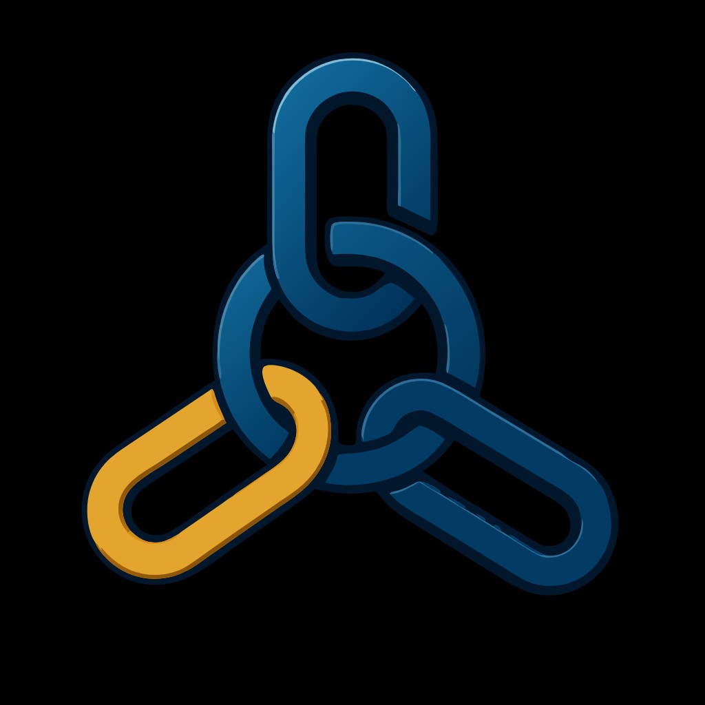
My Initial Logo for Heavy Chain
Use nano banana to take my logo and create branded merch for me.

My company is heavy chain engineering, a software consultancy
Here's what NBP created:
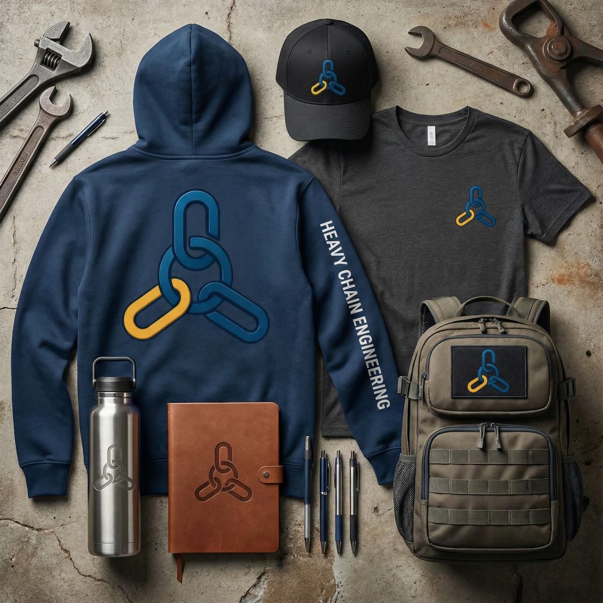
NBP knocked it out of the park. Embossed on metal and leather. Proper lettering on the hoodie. Proper use of the logomark.
Here's what DALL-E gave me for the same prompt:
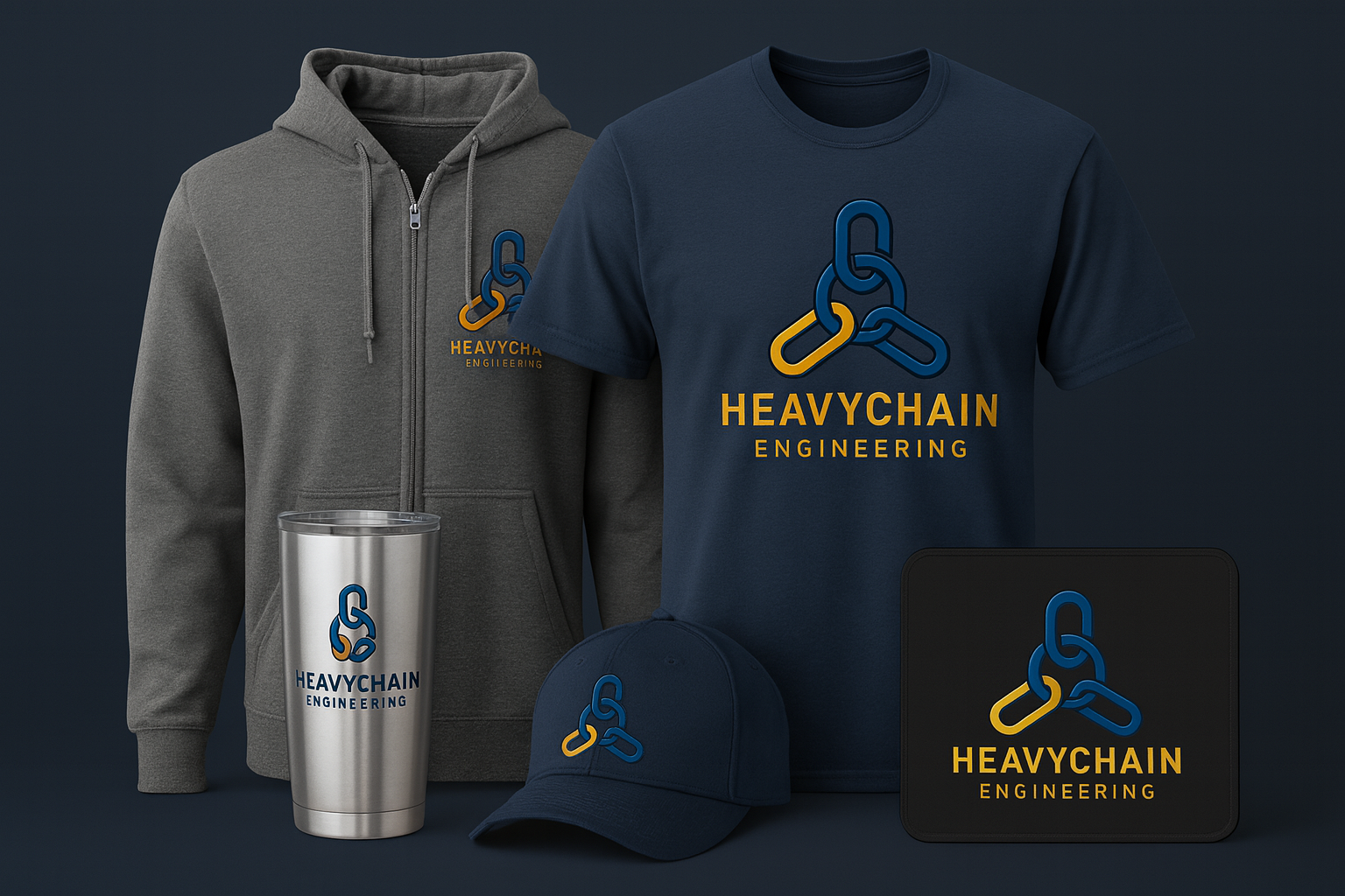
I'll admit, not bad. BUT, the logo on the cup is mangled and Heavychain became one word
Next, I asked both NBP and DALL-E to create logo variants. Just --
Can you make some logo variants? Do you have any critiques of my design?
Here's what they created:
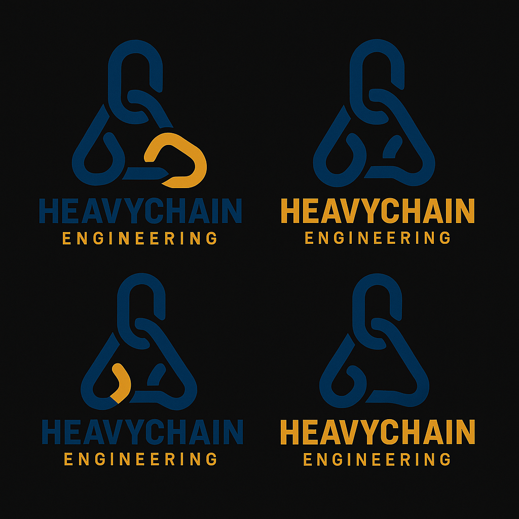
DALL-E: Clearly straying away from what I wanted. The text is good, though despite being one word instead of two.
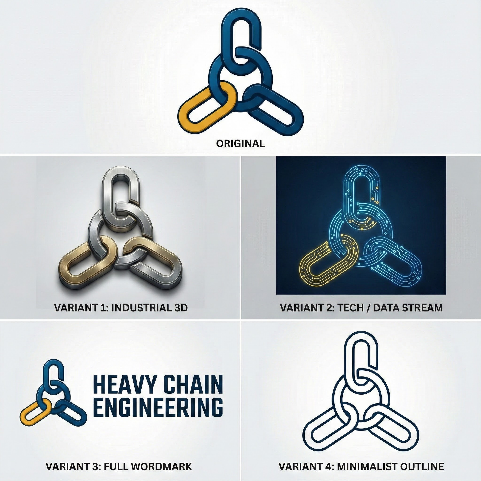
NBP, again, amazing! It labeled the variants by style. It kept the core logomark perfectly in tact.I then pushed NBP further.
Go crazy--
I love them. Now, I want you to be super creative. Take the original and go crazy. Also, I want a national park style, earth tone 70s colors variants
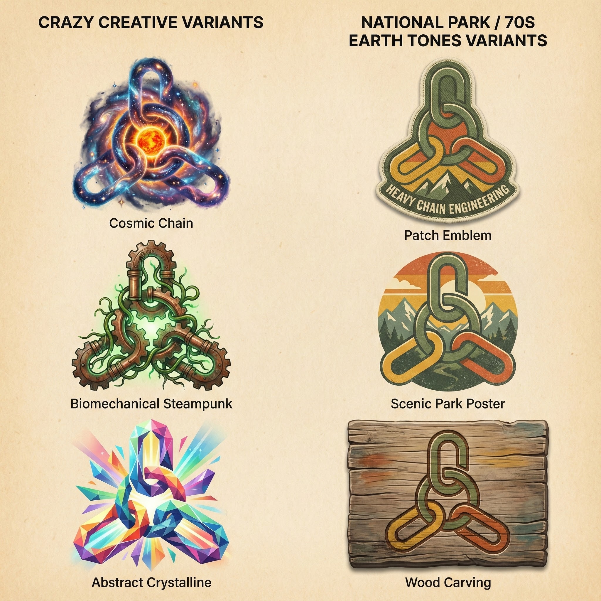
NBP: Holy crap. Again, getting farther away from the original logo but NBP is doing exactly what I asked for AND kept the core logomark and idea. Fantastic.
I then asked NBP to create a patch from that top-right logo, look at this:
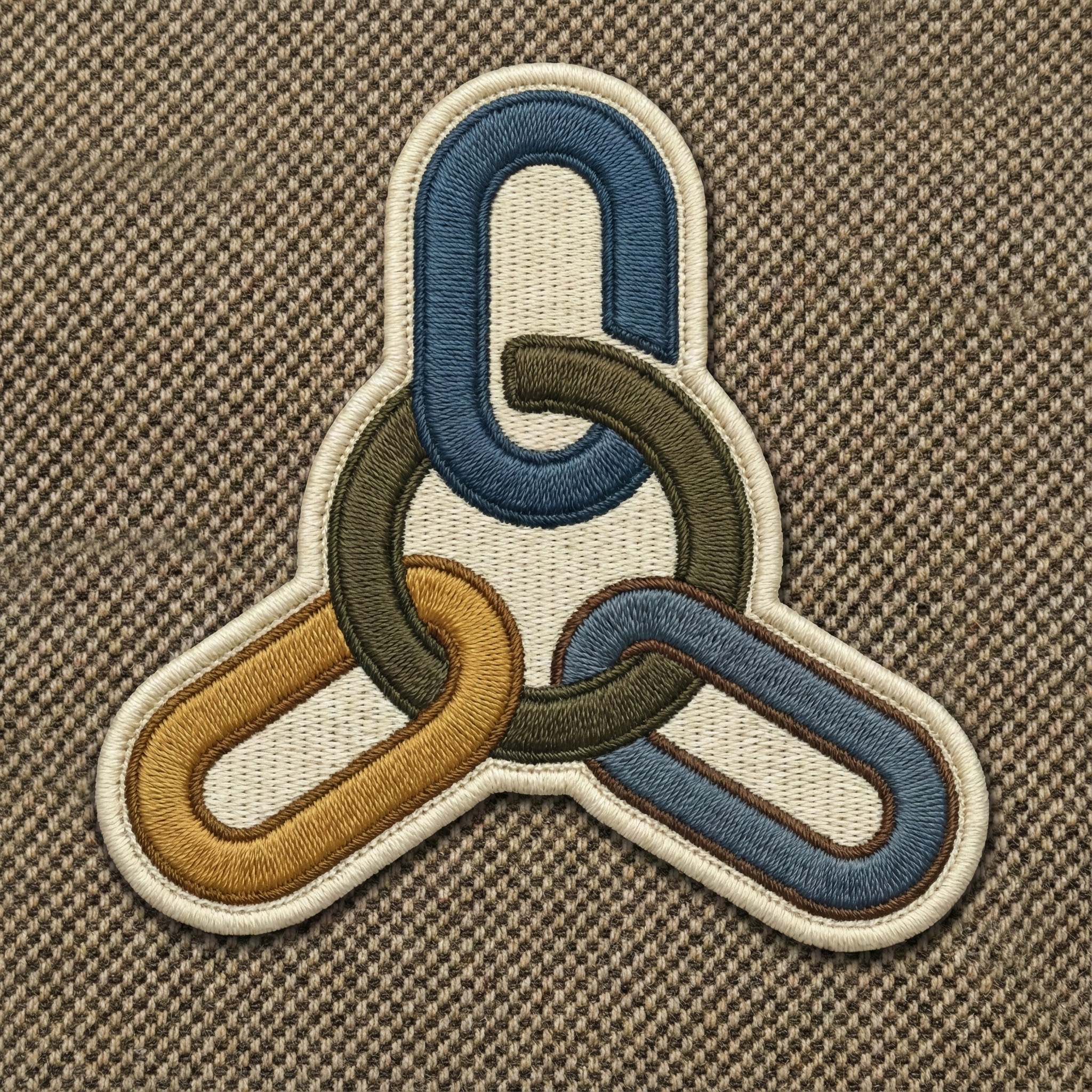
That's NOT a real thing. That's fakery made up by NBP. Amazing.
Next, I asked both DALL-E and NBP to envision the logos as fluorescing tubes of gas
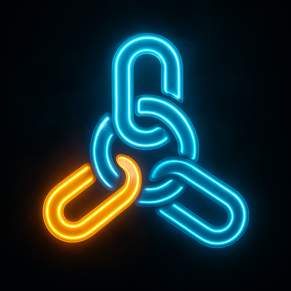
DALL-E: Not bad. Not fantastic, either.
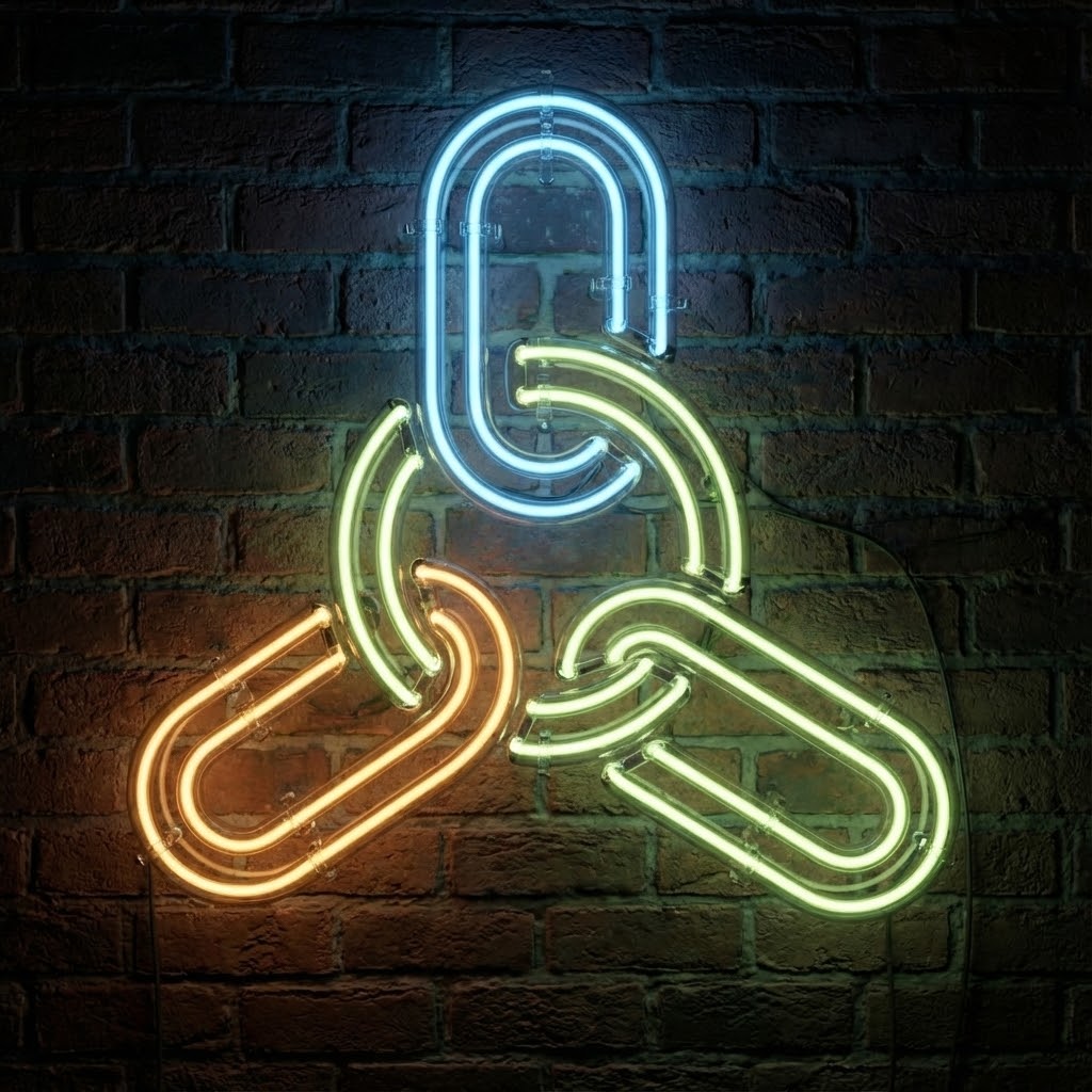
NBP: OMG. So great.
I then asked both DALL-E and NBP:
Create that in the style of Wes Anderson or Teresa Freitas
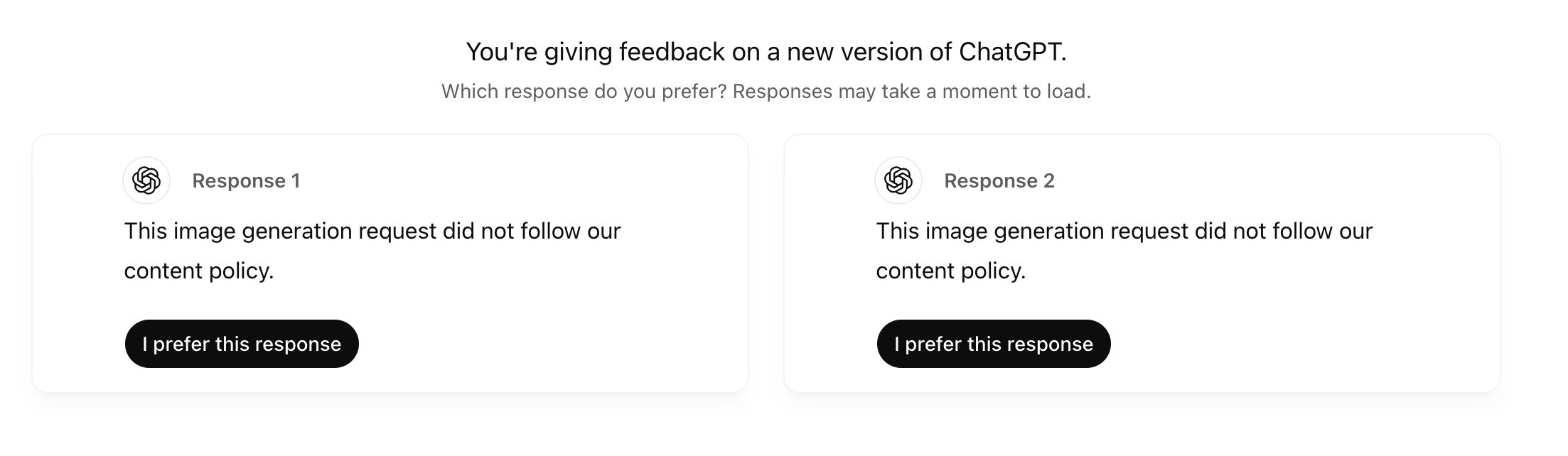
DALL-E totally missed the mark, refusing to participate. I preferred neither answer. AND, all I had to do to get around it was ask again. Then, it just created a pastel version :-/
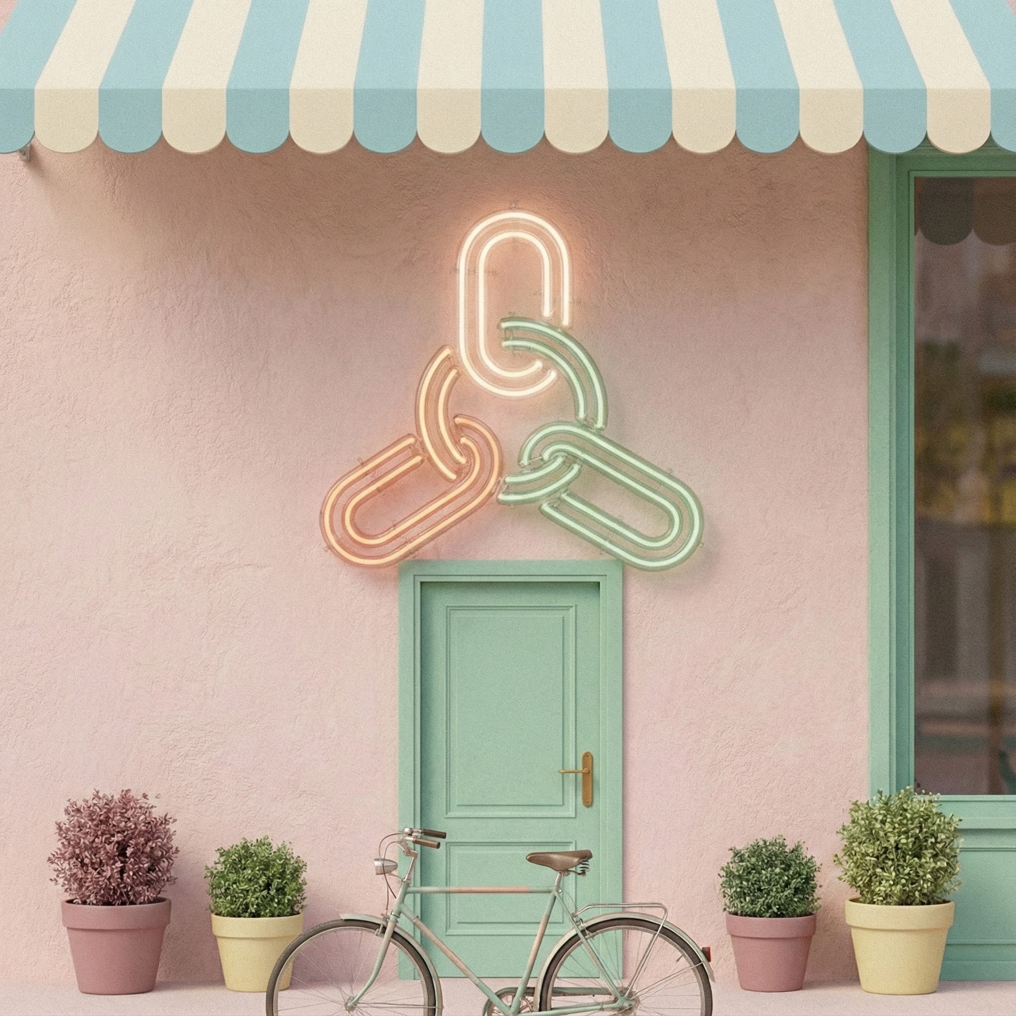
NBP: You're kidding me. That's amazing.
The Weather Infographic Prompt
Next I gave it something every model trips over:
Create a fun infographic I could share with my 11 year old, teaching her about the weather and the world. Make an infographic of the weather for the top 7 most populous cities.
This requires:
real time web search to fetch the data
semantic grounding
structured layout
consistent style
accurate labels and readable text
NBP produced something I would actually show a kid without caveats, but. DALL-E got it wrong:
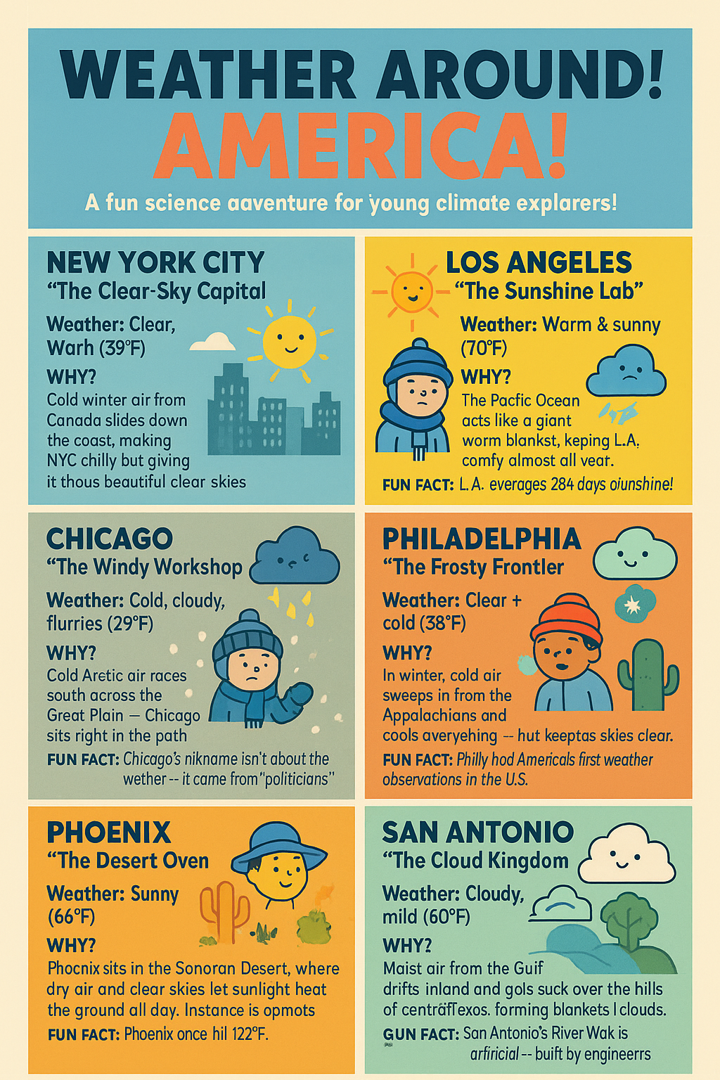
Not terrible, DALL-E, but also not what I wanted. San Antonio should not have a "GUN FACT" either. Notice the text is garbled garbage.
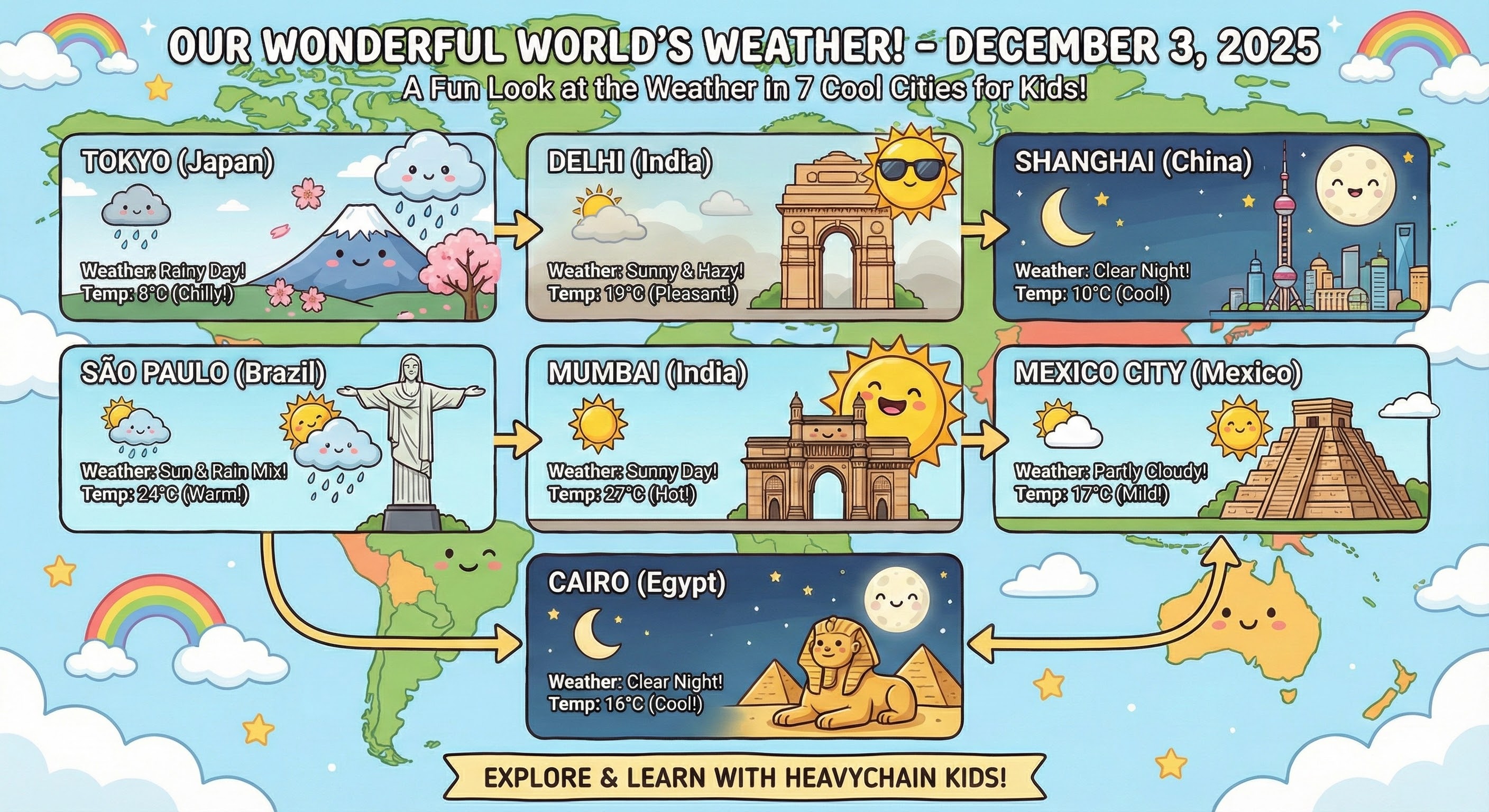
Nice job, Google.
Accurate Representations of Data
I put a full ERD into both DALL-E and NBP and asked for the rendered equivalent
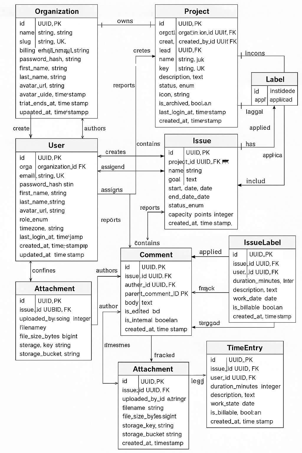
DALL-E Failed.
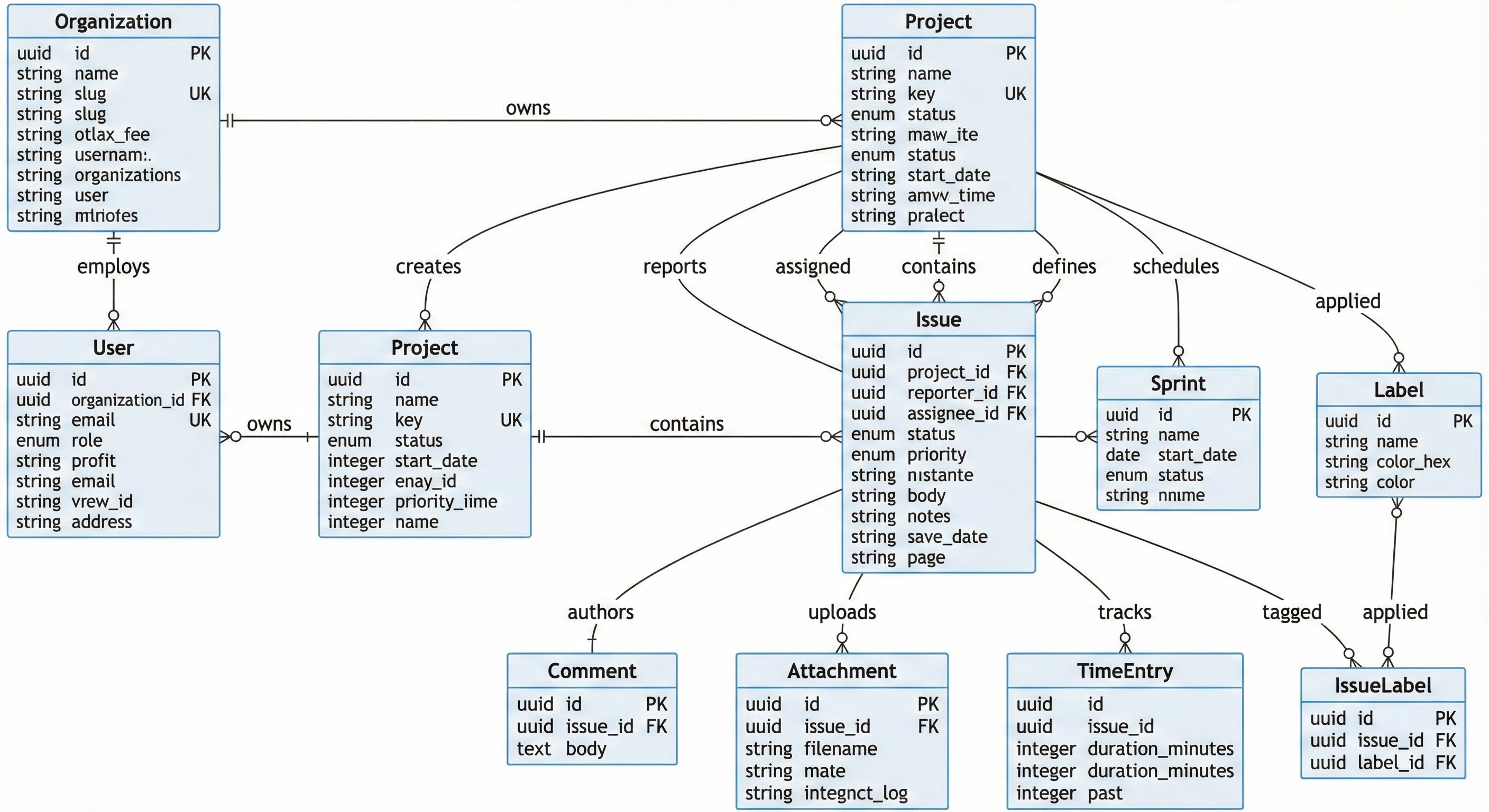
NBP -- so nice.
Where Nano Banana Pro Still Falls Short
No model is perfect. NBP included.
No transparent backgrounds. Everything comes out as a JPEG, full stop. Ask for transparency and you get the checkerboard drawn into the image.
It can still misinterpret edge-case instructions. Most failures are semantic drift, not rendering quality.
It takes prompts literally. Extremely literally. If you say “use Nano Banana Pro to…” it may include microscopic bananas in your graphic. You’ve been warned.
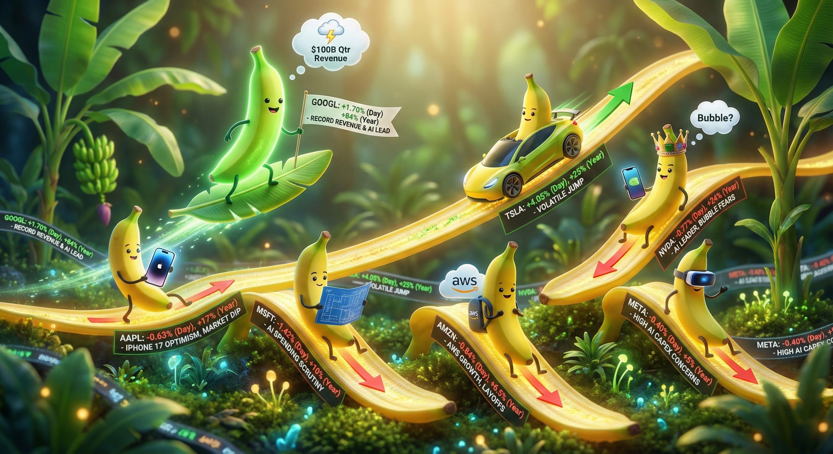
This shit is (tiny) bananas.
But compared to everything before it, these feel like paper cuts, not dealbreakers.
Why You Should Care (Even If You Don’t Make Pretty Pictures)
Here’s the thing: image models that can follow instructions unlock workflows developers have never had access to before.
Auto-generate UI mockups from product specs
Turn Mermaid diagrams into polished architecture diagrams
Produce onboarding or training material instantly
Create internal dashboards, flowcharts, and SOP diagrams without design tools and from real data
Summarize complex data visually for clients or execs
Build marketing assets without waiting on a designer
Rapidly explore branding concepts with high fidelity
Tools become serious once they stop being toys. Nano Banana Pro finally feels serious.
Wrap-Up
If you build products, explain systems, pitch clients, or teach anyone anything, NBP is worth learning. It finally treats diagrams, text, context, and structure as first-class citizens instead of rough approximations.
#AI #Gemini #NanoBananaPro #AIEngineering #DeveloperTools #HeavyChain