

In Part 1, I shared the painful realization many technical builders eventually stumbles into: you can’t prompt-engineer your way to good visual design.
Natural language in a chat box is fundamentally the wrong interface for spatial geometry. If you ask an AI to "make it clean and modern," you get the default 2025 AI starter pack—floating glass cards, electric purple gradients, and pulsing pill badges. And if you spend three hours asking it to "de-slopify" the output, you just end up looking like the smaller crowd of people who tried slightly harder to make their generic templates look polite and sterile.
To break out of that local minimum, I stopped treating the AI like a magical text Oracle and started treating it like a participant in an architectural charrette—a classic design show where you sketch contrasting, polarized directions side-by-side, eliminate bad ideas through rapid negative falsification, and isolate variables one by one.
It completely transformed how I ship software. But to make that process repeatable across all my projects, I needed to automate it into a real, frictionless software tool.
Today, I’m sharing that tool: Heavy Chain Design Studio.
It’s open source, it lives right inside your coding assistant (Claude Code, Google Antigravity / Gemini CLI, or Cursor), and in this post, I want to walk you through how it actually works, how to use it, and what happens under the hood when you give it raw, unvarnished engineering feedback.
The Big Secret: It Translates Your Raw Gut Feedback
The single most important design decision behind Design Studio is this: you do not need a visual design vocabulary to use it.
Most engineers know exactly when something looks clunky, cheap, or off-balance. What we lack is the specialized jargon to tell an AI what CSS properties to change without causing collateral damage.
Design Studio is designed to bridge that gap. As you interact with it, the system actively attempts to learn your project and your specific taste profile. The more you tell it in your own plain, unvarnished words what you like and what you hate, the better it gets at teasing out the real underlying meaning of what you’re trying to say under the hood.
You don’t have to know the name of a font classification or the math behind line-heights. You can literally just say:
“That font is terrible for what I want here. It doesn't work with this design at all.”
“The colors lack contrast. Figure that out.”
“The content feels way too cramped—give it room to breathe.”
“Option A looks like a boring enterprise tax firm. Option C is radioactive. But Option B has the right bones.”
In fact, one of the best ways to get great results out of the studio is to scold it bluntly. If an iteration looks awful, tell it straight: “Hey, this design sucks. It’s clunky, it feels like an AI template, and here are the three things that bother me.”
And when it nails something, tell it: “This is fantastic. I love how the headline sits against that open space.”
The "Mind-Reading" Breakthrough: When the Voice Rant Actually Worked
I have to share the moment where this clicked for me personally, because it blew my mind.
I was a few rounds into a session on a design I cared deeply about, and I was getting frustrated. The back-and-forth wasn’t quite landing. The AI was trying, but it was still hovering around that polite, generic territory.
Instead of typing another polite prompt, I threw my hands up, turned on my voice recorder, and just spoke completely extemporaneously.
I didn't try to sound like a designer. I didn't try to be nice. I just let loose a frustrating, stream-of-consciousness rant about everything I hated: “This feels clunky. That font makes no sense here. It feels like an AI template. The cards are boxing everything in, the hierarchy is a mess, and it just doesn’t feel like an authoritative engineering firm.”
I dumped that raw audio transcript straight into the chat and walked away to grab water.
A couple of minutes later, I sat back down. The studio had processed the rant and updated the browser deck: “Hey, check out these three new directions.”
I clicked on Candidate B. My jaw dropped. “Wait a second… this is really cool. I love the way this headline breathes. I love that baseline. That actually looks like something I’d be proud to ship.”
I gave it some quick feedback on the spacing. On the next round, it nailed it again. And the round after that. For the next three or four iterations, it hit the mark so accurately it felt eerie.
I was literally flabbergasted. I stopped and asked it in the terminal: “What are you doing right now? How are you reading my mind?”
And the tool replied:
“I deeply considered what you’ve been saying across your feedback. While you weren't using formal design terminology, I discovered that you hate decorative crutches like left-accent borders, you crave architectural mass and concrete permanence, you don’t want forced playful metaphors, and you demand pure typographic hierarchy over nested containers. I’ve simply been honing every single layout decision around that latent model.”
It had translated my raw frustration into an objective architectural compass. It gave me the vocabulary for what I was reaching for, but couldn't articulate on my own.
How It Works in Practice: The In-Browser Atelier
So what actually happens when you type /design-studio into your coding agent?
Here’s the whole flow on one page; the rest of this section walks through it.
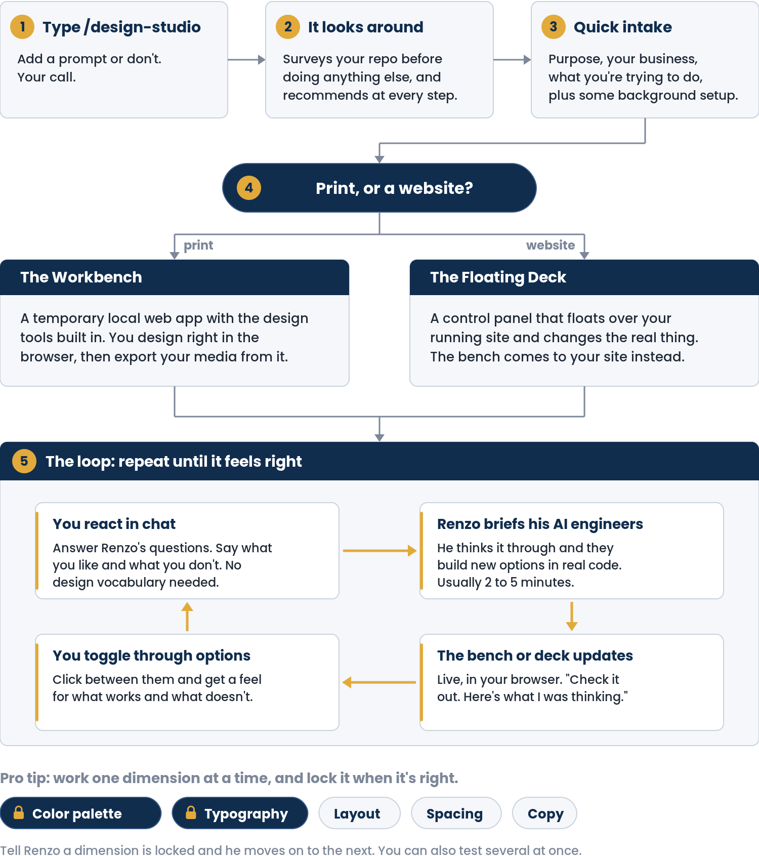
First, it doesn’t immediately start vomiting CSS into your codebase. It shows some initiative by taking two minutes to anchor on your project’s reality. It quickly checks your repo for existing design tokens (DESIGN.md, custom fonts, Tailwind configs, or SVG marks). If starting from scratch, it asks four quick questions: your commercial objective, the target medium, the desired tone, and any hard constraints.
Craftsman’s Pro-Tip: Turn on your voice dictation tool, talk out loud for 60 seconds stream-of-consciousness, and dump the raw transcript in. Don't worry about formatting. The studio parses your braindump into structured constraints and sets up your drafting table. (If you don't use your operating system's built-in tool, I use Superwhisper and absolutely love it—it’s local, fast, and remarkably accurate).
Once anchored, the studio doesn't trap you in the terminal. It spins up a local web server and opens your browser.
Depending on what you’re designing, it automatically selects between two purpose-built environments:
1. The Standalone Workbench (For Brand Marks, Logos & Print Collateral)
If you’re designing standalone visual assets—like a vector logo, a brand mark, or an executive one-pager—the studio boots up a dedicated local Vite workbench.
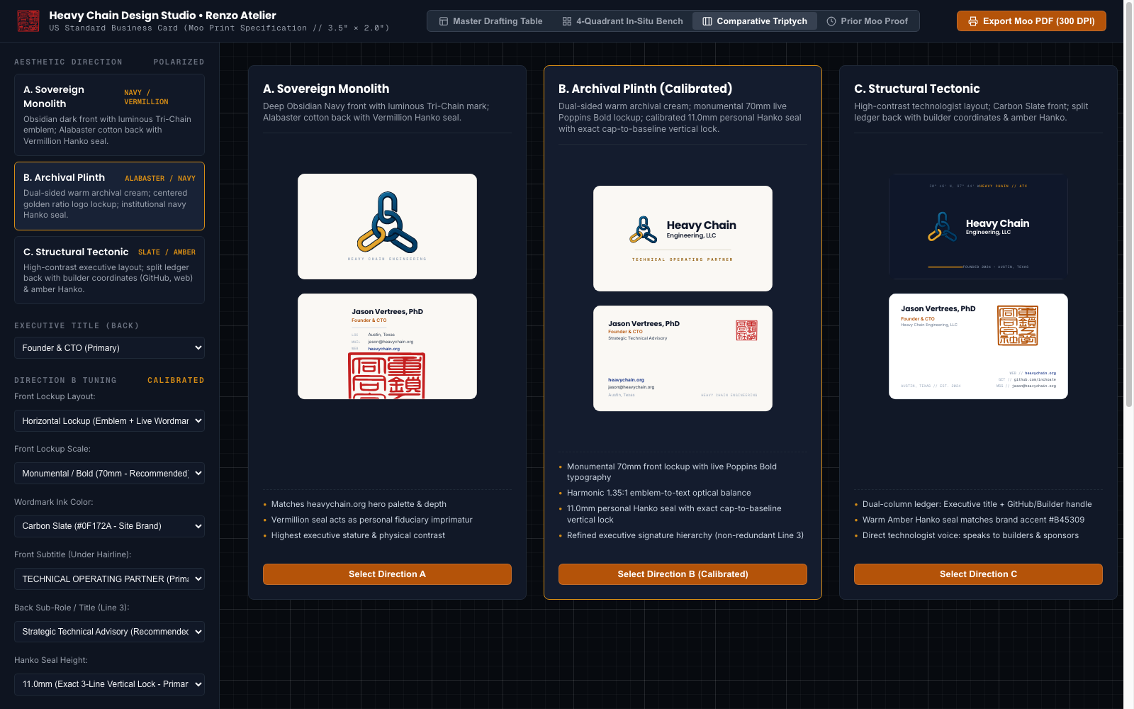
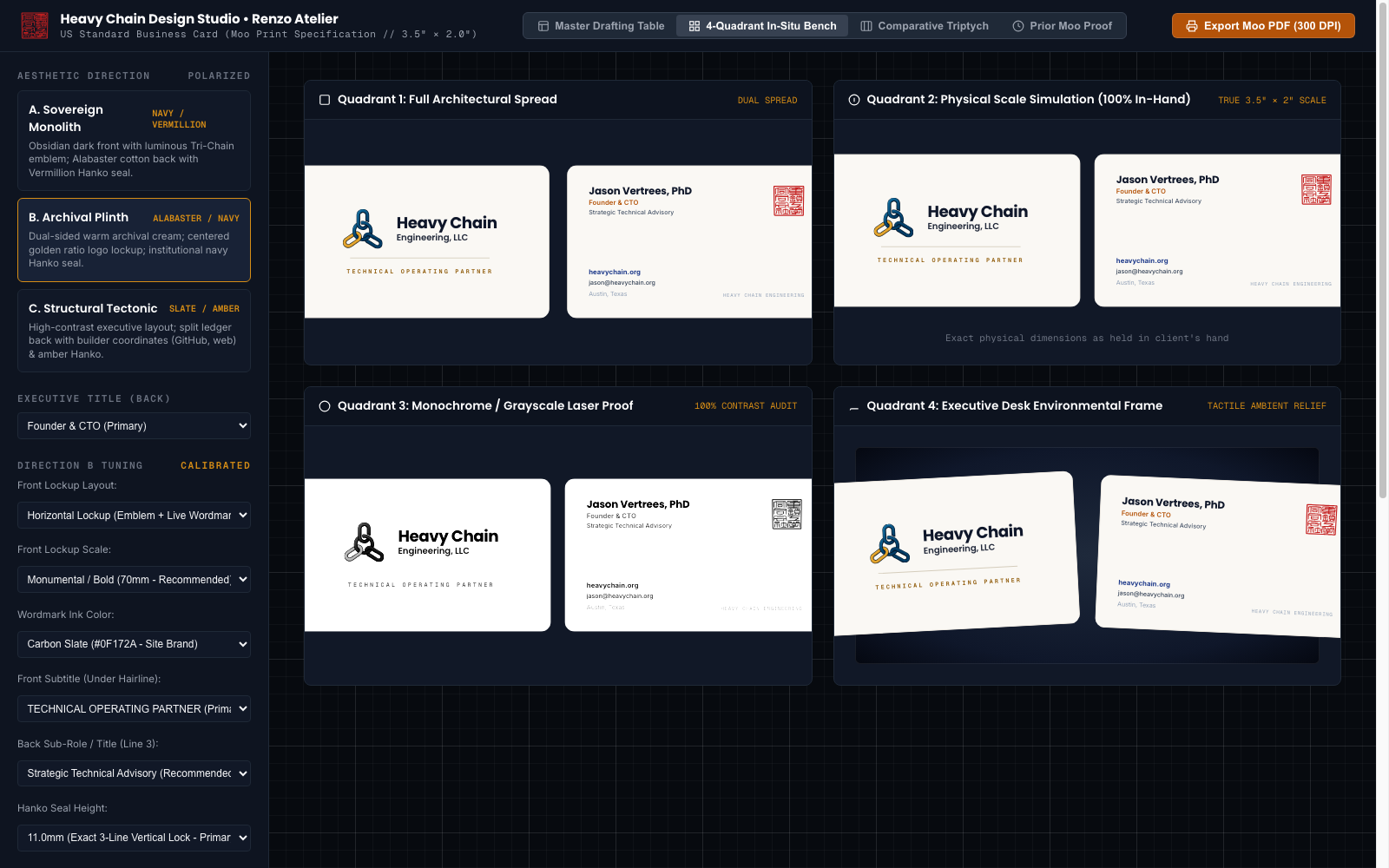
The screenshots below are from designing my new business cards (the before-and-after is in Part 1).
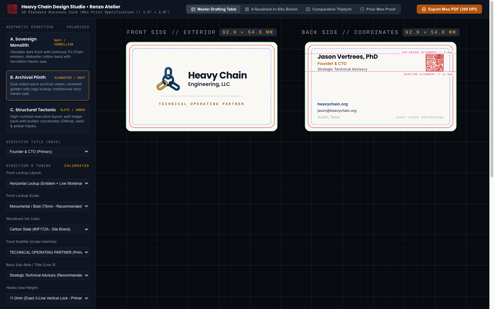
Inside your browser, it presents three distinct evaluation surfaces:
The Master Drafting Table: An interactive vector canvas with construction grids, geometric alignment axes, and one-click SVG export.
The Physical & Scale Testing Bench: Tests your asset in real-world contexts simultaneously. You can see your mark scaled down to a 16px favicon, embedded in a realistic application header, placed on physical paper or slate textures, and inverted across high-contrast light and dark backgrounds.
The Comparative Triptych: Presents three distinct, polarized candidates (A, B, and C) side-by-side with explicit trade-off notes so you can eliminate bad directions immediately.
2. The Floating In-Situ Console (For Web Apps & Landing Pages)
If you’re working on an existing web application or marketing page, wrapping it in an artificial workbench would break your styles, routing, and bundler setups.
Instead, the studio injects the Renzo Atelier Deck—a lightweight, non-invasive floating drawer—directly into your running app (localhost:3000, localhost:5173, etc.).
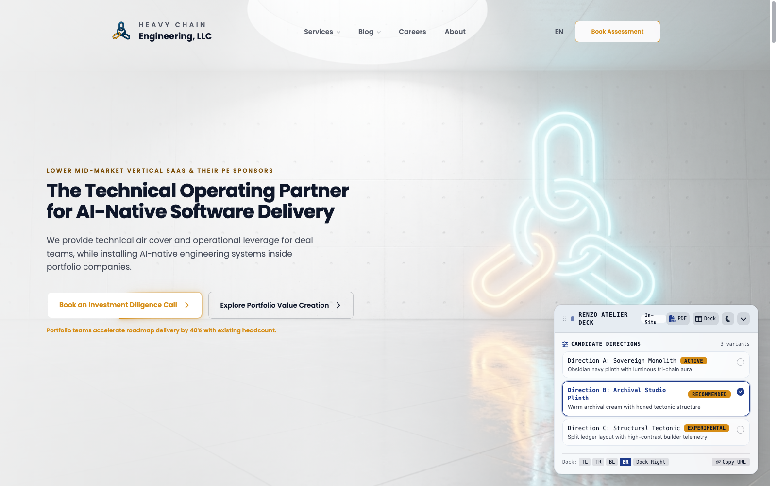
This floating control panel gives you a live dashboard right over your real DOM:
Live Variant Switching: You click through
Candidate A,Candidate B, andCandidate Cinside your actual app, with real routing, real fonts, and real viewport breakpoints.Interactive Tuning: You can toggle light/dark modes, test high-contrast stress tests, or adjust container widths and padding on the fly.
Zero Production Residue: The floating console exists only during your design charrette. Once you approve a candidate, the studio promotes the winning code to your production files and cleanly unmounts the test harness.
The Back-and-Forth Loop (And Why You Must Isolate Variables)
Once the workbench or floating deck is live in your browser, the real charrette begins.
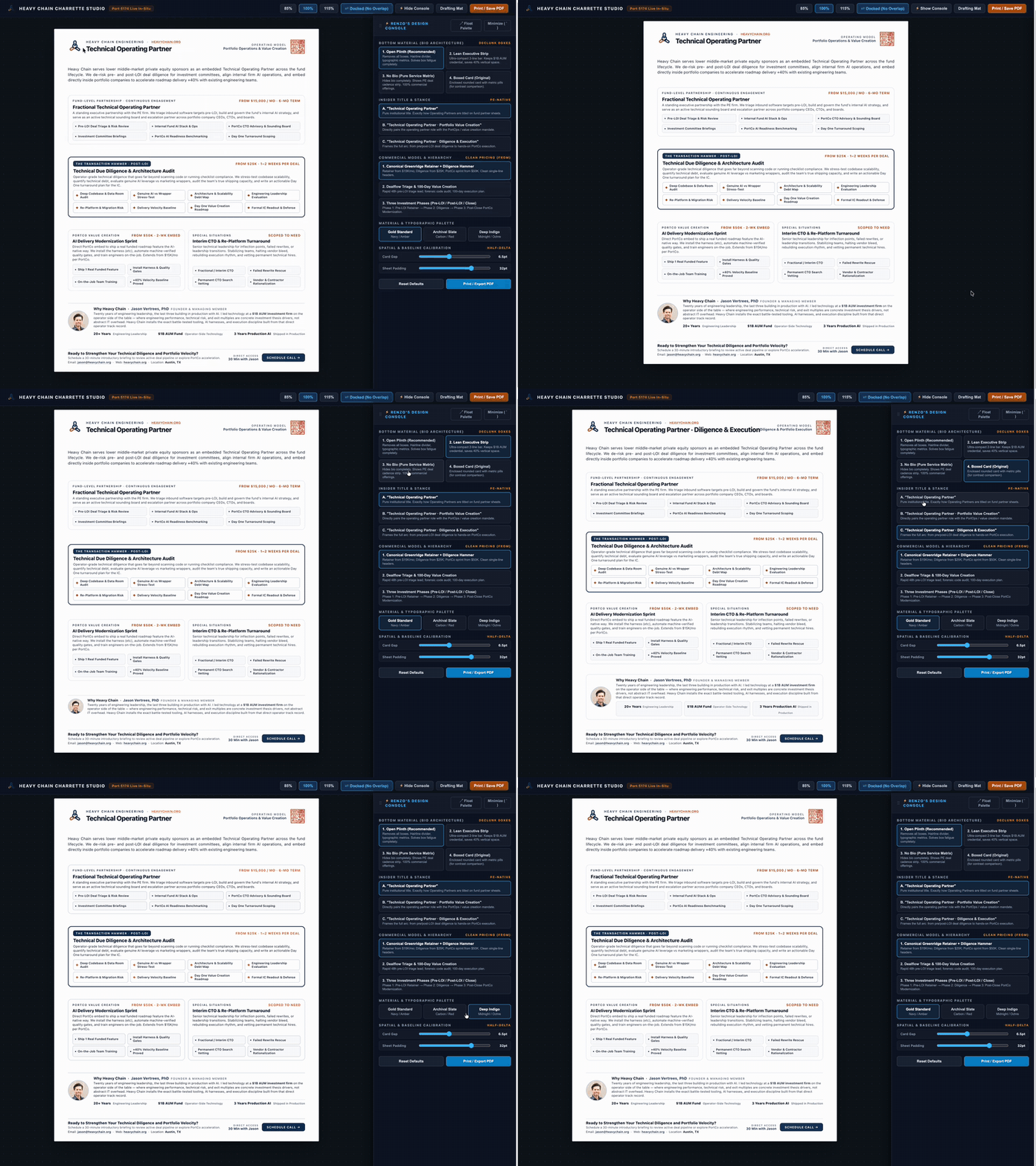
The workflow is wonderfully tactile. You click through the options in the UI control panel, see what they look like in real life across viewports and scales, and then react in chat.
You give your feedback—scolding what’s clunky and praising what works. The studio takes that in, goes off and thinks, updates the UI control panel you just interacted with, offers new candidate suggestions, and hot-reloads the changes in your browser in seconds. You go back and forth until the design locks in.
Setting expectations: after you submit your feedback to the AI its thinking and developing time could be up to a couple minutes. It feels slow sometimes, but in comparison to what it's actually creating -- real clickable mockups you can play with it's very fast overall.
Here’s about a minute of one real iteration on my one-pager: clicking through options in Renzo’s console while the page updates in place.
Pro-Tip: Decompose into Independent Design Variables
The single most powerful trick to getting exceptional results out of the studio is separating the work into distinct variables.
When people struggle with AI design, it’s almost always because they try to evaluate colors, padding, typography, layout, and copy all in a single pass. If you change four variables at once, you will never know which one ruined the composition.
Instead, ask the tool: “Let’s break this down into design variables and tackle them one at a time.”
Are we looking at Layout & Information Architecture (IA)? Get the structural bones, the containers, and the visual weight right first.
Are we looking at Negative Space & Padding? Give elements room to breathe before fiddling with colors.
Are we looking at Typography? Settle the font hierarchy, reading cadence, and line-lengths.
Are we looking at Colors & Contrast? Lock in the palette and verify strict accessibility contrast.
Of course, some variables are naturally interrelated. Your information architecture and layout heavily depend on the actual copy. The cool thing about Design Studio is that you can do progressive passes or feed multiple copy variants into the system all at once, and it will mock up the UI variants to show you how each one behaves.
Behind the Curtain: "Renzo Never Codes"
One of the technical reasons this back-and-forth loop feels so fast and focused is an architectural rule we enforce under the hood: Renzo stays firmly at the drafting table with you.
In typical AI tools, the agent trying to design your page gets instantly distracted by broken imports, missing dependencies, or TypeScript compiler errors. The entire creative conversation gets lost in terminal noise.
In Design Studio, Renzo is strictly the master architect and design counsel. He never edits code directly in his conversational context. When you agree on a direction, Renzo delegates the construction to background subagents. They do the file modifications, run the builds, verify tests, and trigger the browser hot-reload, while Renzo stays completely focused on spatial balance, aesthetic resonance, and collaborating with you.
Real-World Physics: The Zero Box-Shadow Discovery
One of the coolest things about building this tool was discovering real-world rendering bugs that standard AI prompt loops completely miss.
When we were designing executive print collateral, we noticed something bizarre: circular avatar headshots and rounded buttons had an ugly, sharp-cornered gray rectangular halo behind them when opened in Apple Preview or macOS Quartz PDFKit.
We dug in and found the root cause: headless Chromium --print-to-pdf rasterizes CSS box-shadow combined with border-radius as unclipped alpha soft-masks (/SMask). Quartz fails to blend those soft-masks properly against tinted backgrounds, rendering an opaque rectangle matching the outer blur bounding box.
Because we built those hard-won lessons directly into Design Studio's doctrine, the studio automatically enforces the Zero Box-Shadow Rule for print collateral—elevating elements with crisp vector hairlines and solid fills that print razor-sharp with zero artifacts.
Wrapping Up the Design: Commercial Reality & The Taste Capture
In the design community, there’s an old romantic saying: "Design is never finished, only abandoned."
That mindset might be fine for an art gallery, but it’s lethal for an engineer or founder trying to ship a real product. It leads directly to endless bikeshedding—tweaking margins by two pixels for three days and staying trapped in perpetual prototype purgatory.
Design Studio operates on master-craftsman pragmatism. When a design achieves structural honesty, satisfies the commercial objective, and has zero AI slop, Renzo calls the finish line with authority:
“This is clean, robust, and shippable. It achieves the business objective with high craft, structural honesty, and zero slop. Let's lock it in and ship it.”
When you give the green light:
The winning candidate is promoted directly into your production markup.
The temporary
.studio/test harness is cleanly unmounted with zero leftover production residue.You export what you need (like clean, optimized SVGs) and move on to building what’s next.
The Wrap-Up Question: Capturing Your Taste Permanently
Before you close your terminal, there is one final pro-tip that makes every future session ten times faster. Ask the tool:
“Tell me what you learned about me and my design taste today.”
The studio will pause, synthesize your entire session, and reflect your own subconscious taste back to you in clear, plain English. Even better: it writes those lessons directly into your project's DESIGN.md (or .studio/taste.json).
That means your brand guidelines, your pet peeves, and your aesthetic standards are permanently captured in your repository. The next time you—or anyone else on your team—runs a charrette on that codebase, the studio already knows your rules. You never have to re-teach it.
Kick the Tires (An Honest Caveat & Invitation)
Here is the unvarnished truth: this tool has worked wonders for me multiple times.
I’ve seen the before-and-after transformations across my own projects, and I love using it. A few friends and collaborators are starting to see some really interesting results with it as well—but literally only three or four people have used this so far.
It is brand new, it is opinionated, and I am putting it out there publicly so you can kick the tires.
How to Install It
Design Studio is completely open source under the MIT License on GitHub:
👉 github.com/Heavy-Chain-Engineering/design-studio
If you use Claude Code, Google Antigravity / Gemini CLI, or Cursor, you can install the skill globally with a single command via the skills CLI:
npx skills add Heavy-Chain-Engineering/design-studio -g -y
Or clone it directly into your project's .agents/skills directory:
git clone \
  https://github.com/Heavy-Chain-Engineering/design-studio.git \
  .agents/skills/design-studio
Come Hang Out
If you take it for a spin, I’d love to know what breaks, what confuses you, and what works.
And if you run a charrette and get a great before-and-after out of it, please show it off—seeing engineers take pride in craft and produce beautiful, distinctive work is one of the coolest things happening in software right now.
Come join us in the Heavy Chain Discord Community:
👉 discord.gg/An8yQfFpM.
It’s where we talk about AI-based and AI-powered design, modern agentic software engineering, and just living our best lives in this wild new world of AI. There's also a channel just for the Design Studio. (If you join, please share some before/afters.)
Give it a shot, scold the AI when it's clunky, and let’s stop settling for slop.
AI attribution: 3/4 — Human-originated, AI-shaped. What this means
Jason Vertrees is the founder of Heavy Chain Engineering, which helps lower middle-market vertical SaaS companies and PE firms turn scattered AI usage into measurable delivery leverage — 85% faster feature velocity, six-to-eight-week projects shipped in days. If you want help building an AI-native engineering organization, book an AI Delivery Assessment or email jason.vertrees@gmail.com.