

For decades, I’ve held graphic designers, visual artists, and creative directors in extraordinarily high regard.
I’ve always wanted to be able to create something I considered truly beautiful, but I simply didn’t have the hands for it. I’ve always had taste—I knew what moved me, I knew what looked off, and I had an acute radar for balance and quality—but as a backend guy and technical leader, I could never translate that taste into code or pixels. I couldn't communicate it across the gap, and I couldn't get an interface to the point where I actually wanted it to be.
Then generative AI tools arrived.
For technical leaders and backend developers like me, it felt like a massive win. Suddenly, we could move on the frontend with real speed. The initial interfaces these tools produced were, frankly, usually better than anything I could have hand-coded from scratch. For a brief moment, it felt like the barrier between technical capability and frontend execution had vanished.
Then the reality set in.
That same breakthrough unlocked a massive groundswell—a juggernaut of cookie-cutter AI slop that flooded the web.
Because I’m a careful craftsman, I put my work out there feeling good about it. I had tweaked it, tuned it, polished it, and thought, “Hey, this looks great.” And then I looked around and saw a thousand websites that looked exactly like mine.
That was completely unacceptable. The last thing I ever want is to be grouped in with people who are lazy, cutting corners, or shipping generic filler.
So what do you do? Because you actually care about your craft and want your work to stand out, you go back to the keyboard, roll up your sleeves, and dig in harder. You start prompting with a vengeance: “Let’s de-slopify this.” You fine-tune little bits of design here and there. You strip the loudest gradients. You tweak margins, tweak padding, and fight the model to remove the obvious clichés.
And then you step back, look at your screen, and realize the awful truth: you now look exactly like the people who went that second step.
It’s a smaller subset of people, sure, but it’s still unmistakably AI slop. You’ve just promoted yourself from the giant crowd of people who accepted the first prompt to the smaller crowd of people who tried a little harder to make their generic output look polite and sterile.
Realizing that was painful. It was a local minimum, and no amount of prompt tweaking was going to break out of it.
So, I sat back and thought about my career.
Over the years, I’ve had the genuine luxury of working alongside some truly remarkable designers. Two of them, early in my career, really opened my eyes: John Leonard and a UX researcher I worked with at Schrödinger (once I remember his name, I’ll fill it in). There have been many others since, and they were amazing and valuable too, but those two taught me more than they probably realized.
One of the most enduring concepts I learned from them was the idea of a design show—what architects and industrial designers often call an architectural charrette.
In a design show, you don’t sit alone in an office staring at a blank canvas trying to guess the future. You meet up with your team, carve off a bite-sized piece of creative work, and go off separately to work on it for a short, focused burst that day. Then you come back together to the drafting table, pin your work up, and compare results.
It’s a rapid, iterative back-and-forth. You look at three completely different directions side-by-side. You immediately discard what doesn’t work, identify what has real structural bones, and combine the best ideas into something far stronger than anyone could have built in a vacuum.
Remembering that dynamic made me wonder: Could I adapt this into an automated software loop? Could I design my own design charrettes powered by AI?
I knew immediately that it couldn't rely on a single, rigid set of aesthetic rules. There is no such thing as a global, one-size-fits-all definition of "good design." Taste is subjective, and every single project has a different soul. An institutional advisory firm requires massive architectural weight, concrete permanence, and serious credibility; a playful developer tool requires speed, lightness, and clean contrast.
The tool couldn't impose my personal aesthetic on everyone else. It had to be able to extract and honor project-specific taste.
At the intake of any project, you have to anchor on the actual domain truth: Who is this for? What reaction must it provoke? What are the non-negotiable constraints? And what aesthetic resonance fits the person building it?
From there, it needed to operate as a Socratic loop. Instead of asking an engineer open-ended questions like "what vibe do you want?"—which immediately leads to paralysis—the system needs to act as a seasoned design counsel at a drafting table. It presents contrasting, polarized directions. It relies on negative falsification—because it is infinitely easier to look at three options and say "I hate A, C is too corporate, but B has the right energy" than to invent a visual system from words.
So, I started building against that concept.
I built a system that separates design thinking from code generation. I gave it a persona modeled after an architectural master craftsman—someone who discusses spatial mass, typographic cadence, and optical physics with you, while background agents handle the file modifications and builds.
I built it to solve my own problem. And the results completely transformed how I ship software.
The Proof: Real-World Transformations
To show you what this looks like when you apply a charrette loop instead of throwing prompts at a chat box, here are two real-world examples from my own work. Both started as well-meaning, AI-assisted drafts that got trapped in the slop cycle, and both were rebuilt using this system.
Case 1: The Commercial Hero Redesign
The original version of this homepage hero was built during my "Round 2" phase. I had worked hard on it, but it was still loaded with the telltale signs of AI iteration:
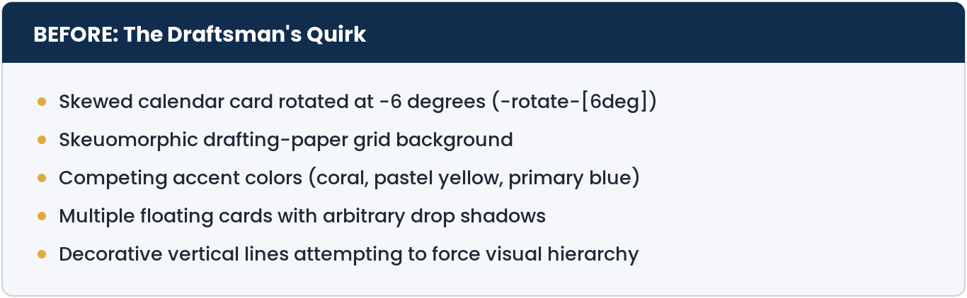
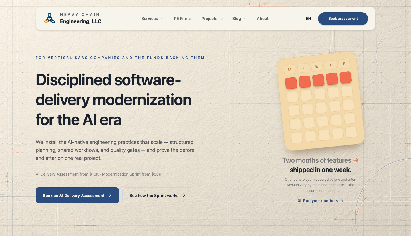
The rotated card was a classic symptom of trying to force "whimsy" where it didn't belong. The drafting paper background washed out contrast, and the layout relied on colored vertical lines to fake structure because the typography itself wasn't doing the heavy lifting.
When we ran this through the studio charrette, we pinned the latent taste immediately: this brand needed institutional gravitas, permanent materials, and engineering truth.
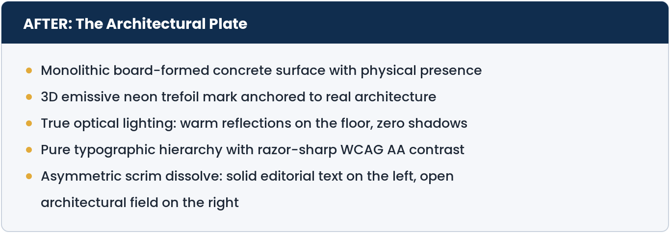
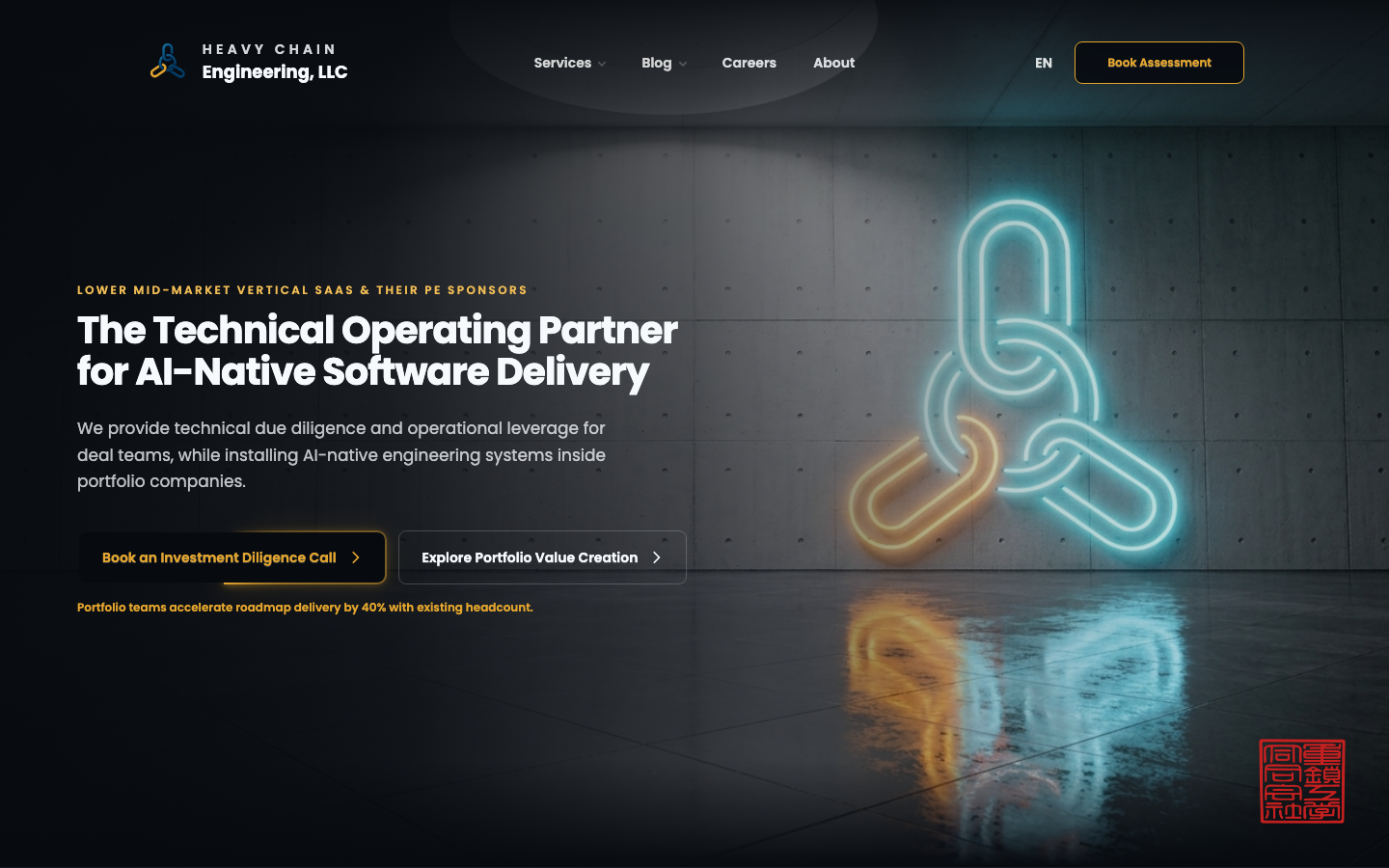
By anchoring the visual world in physical mass and real optical physics (self-luminous neon tubes cast light and reflections; they don't cast muddy dark drop shadows on walls!), the page transformed from an AI-looking template into an authoritative, institutional surface.
Case 2: Executive Print Collateral & The One-Pager
Designing a digital website has forgiveness; you have infinite vertical space to scroll. A single-page executive one-pager has zero forgiveness. You have an exact 8.5" × 11" piece of real estate to convince a senior executive or investor deal team that you are the real deal.
The initial AI attempt was textbook "card soup":
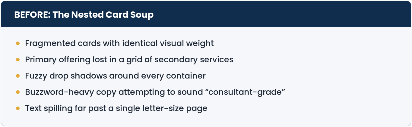
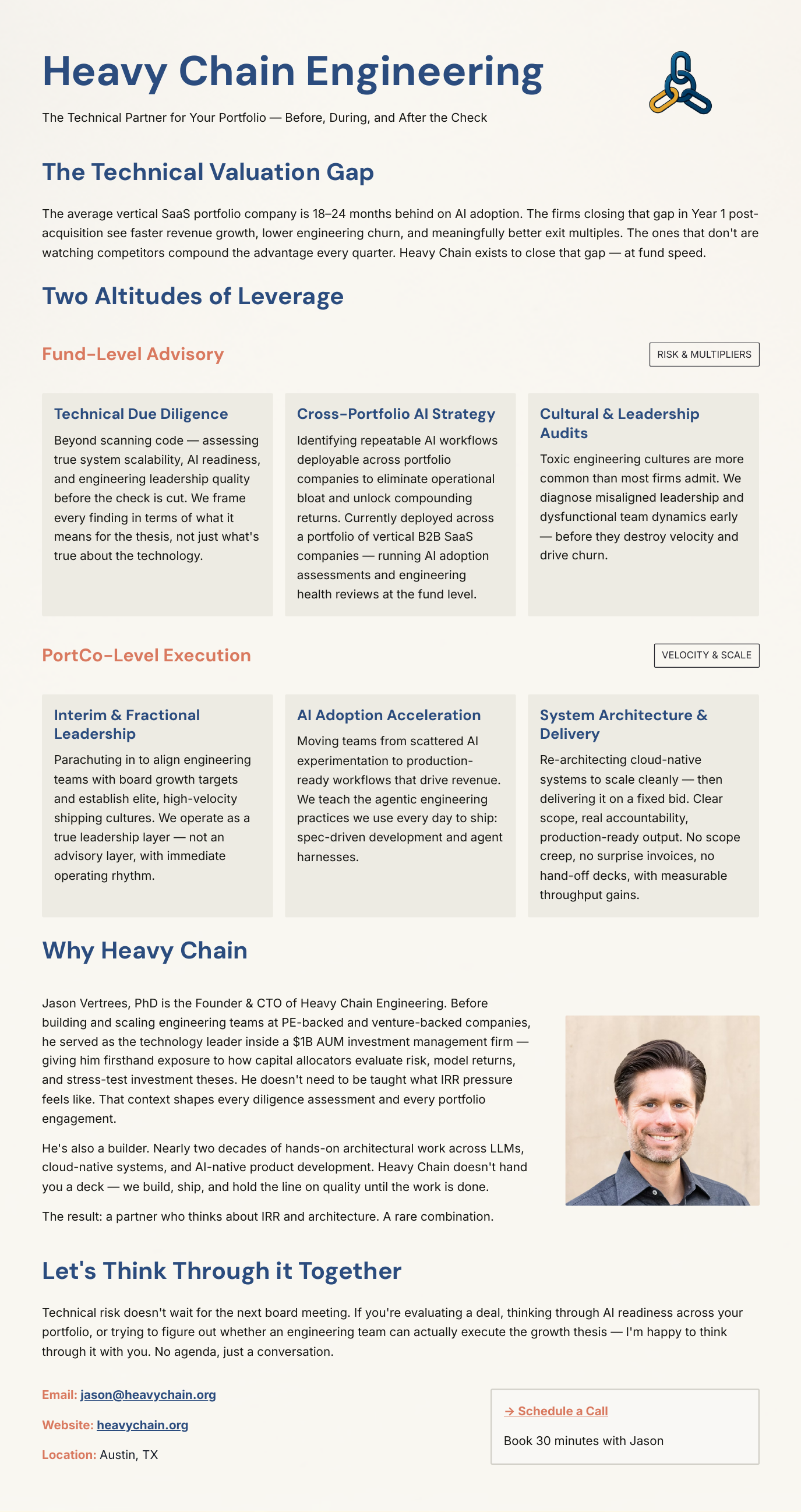
Because everything was in its own little rounded card with its own drop shadow, nothing was important. It looked like an automated export from a project management tool.
Through the charrette loop, we consolidated the lower sections into a single anchor card, established a clear typographic cadence that highlighted the flagship offering, and enforced strict vector printing standards.
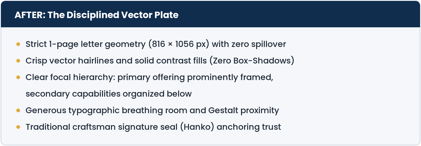
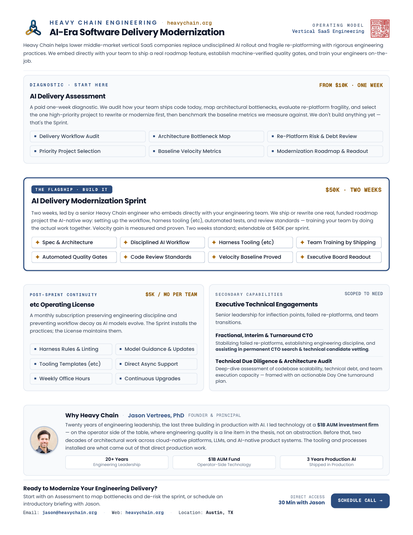
The resulting document is razor-sharp. It prints cleanly, reads in under a minute, and commands immediate respect.
A Word on Real Designers
I want to be unequivocally clear about something: this tool does not replace a designer.
I still hold great designers in the highest possible regard. What a seasoned designer does—understanding emotional resonance, inventing visual languages, reading cultural nuance, and breaking rules with intention—is human art and deep expertise. An AI coding skill doesn't turn a software engineer into Jony Ive or Paula Scher overnight.
What a tool like this actually does is two things:
First, for engineers and technical founders working solo or without a dedicated design team, it raises the floor. It stops us from shipping cookie-cutter AI slop. It gives us a structured, Socratic partner that helps us express our latent taste and build interfaces that look deliberate, clean, and respectable.
Second, and perhaps most excitingly, in the hands of real designers, it acts as a massive accelerator.
Real designers spend far too much time wrestling with the friction of translating design systems into frontend code, dealing with CSS cascades, or exporting static mockups that get butchered during implementation. A tool that brings an automated charrette loop into the actual codebase lets a designer explore ten polarized directions in an afternoon directly inside the running browser. I can see modern creative agencies and design studios leaning heavily into loops like this to test wilder ideas, eliminate boilerplate grunt work, and hand clients live, interactive code rather than static Figma files.
What’s Next
Building this completely changed my relationship with visual design. For the first time in my career, I don’t feel trapped between having taste and being unable to build it. I have a tool that lets me direct design with the authority and standards of an engineering leader.
In Part 2, I’m going to share the tool itself.
I’ll reveal the open-source repository so you can install and use it directly inside Claude Code, Antigravity, or Cursor. I’ll share a video showing exactly how I use it live in the browser, walk through the in-situ testing console, and dig into some of the wild, real-world technical bugs we solved along the way—including why Chromium’s headless PDF engine creates strange gray halos around CSS drop shadows in Apple Preview.
If you’ve ever felt the frustration of fighting with an AI to de-slop your interface, I think you’re going to love it.
AI attribution: 3/4 — Human-originated, AI-shaped. What this means
Jason Vertrees is the founder of Heavy Chain Engineering, which helps lower middle-market vertical SaaS companies and PE firms turn scattered AI usage into measurable delivery leverage — 85% faster feature velocity, six-to-eight-week projects shipped in days. If you want help building an AI-native engineering organization, book an AI Delivery Assessment or email jason.vertrees@gmail.com.